In the words of my one of my classmate's sweet little son, Miles, "Goodness Gracious, what was that?"
This semester flew by, and I am about to click the final submit button to finish it out. We worked on some great projects this semester. I've already shown a little of what our Commercial class covered, and I'd love to show you one of the projects that I worked on in Residential as well.
Our final project was for a real life organization that is near and dear to me. Mary's House is a recovery house for women with addiction and their children. It is in an historic neighborhood very close to my own house, and it is run by a very dedicated and strong woman, Craig Thomas. Mary's House is named for Mary Magdalene and offers an extended housing and recovery program for 8 women and their children at a time. My classmates and I were partnered up, and assigned a room to measure, design, and present. I was fortunate to be able to partner with the oh so fabulous, Sheryl Pugh of Pugh Design Group, and we decided to take on the dining room.
Here are some photos of the dining room as it currently is
Dining room as seen from the door way
Kitchen pass-thru
Hi Tina
Hi Tina
Dining room from far wall
Dining Room Window Wall
When we visited the site for our initial consult, Craig, the Executive Director told us that she loved yellow. She also explained to us the importance of AA and the support system that it provides. So, we decided we wanted to give the space a bright and cheery feel as well as incorporate some custom art with the 12 steps and the 12 traditions. There were lots of simple but inspiring print outs on the walls, but they had all just been printed from the computer in black and white.
Something about the space made me remember this cute little print that I had seen on Etsy, and that became one of our early inspiration pieces.
Sheryl brought in a room inspiration from Pinterest that was right up my alley, and I knew that she and I were on the exact same page.
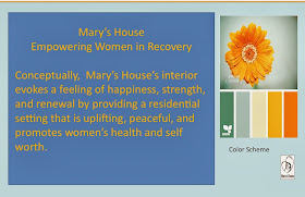
The entire class chose a color scheme from design-seeds that featured warm yellows an corals and light, turquoise and teal.
Here is the floor plan and the proposed cabinet wall elevation
Here is the beautifully rendered perspective of the proposed dining room, looking through the kitchen pass-thru.
And just for fun, we thought it would be really cool to paint their steps with the 12 Promises

We want this space to feel warm, and fresh. Inspiring the women of Mary's house as they venture into a new phase in life. Most of us probably have fond memories of sitting around the dining table with friends and family, discussing everything from how our day at school was, to grade school crushes, politics and important family decisions. We have visions that this space will help to do the same to build fond memories at Mary's House. We not only imagine families gathering around the table to eat, but hope that they will use the space for homework, arts and crafts, and for playing cards and board games.
The presentation went very well, and Craig brought along her friend and fellow interior designer Betsey Isley who asked us to explain some of our design choices, and gave us great feedback. This presentation will be entered into a competition through HGTV, but Sheryl and I are hoping that we can make it happen regardless of whether or not we win!
Check back soon for more posts on other projects as well as links to what my other classmates have been working on!


No comments:
Post a Comment