Just popping in to wish you a happy Valentines Day!
Thursday, February 14, 2013
Tuesday, February 12, 2013
Sping trends
The periphery of spring is coming more to the forefront (especially here in NC where I'm already seeing daffodils blooming!) And for those who might still be buried under mounds of snow, you can at least bring some of these spring trends inside to add a little cheer and color .
Pantone named Emerald Green as its 2013 color of the year. We've already seen this color popping up in clothing and apparel, and it's going to be big in home decor as well. Used in small doses or totally saturating the room, emerald green is lively, lush and luxurious!
Another trend for spring is bright, bold graphics and florals for fabrics. Big bursts of blooms and multicolor stripes and geometrics will be wrapping their way around furnishings and finding their way into our living spaces.
And just as we have peeled down old wallpaper and decreed to banish wallpaper forever, these beautiful prints will steal our hearts and our wall spaces.
Much like wallpaper's triumphant return after being banished into exile, brass is making a comeback too. We'll see brass in metal finishes like lamps and mirrors and knickknacks, but we're also going to see it in hardware such as door knobs, drawer pulls and handles.
Art will also make its way into homes like never before. Not just for museums and galleries and homes of nobility, art has become much more accessible. Etsy lead the way with its 7,000,000 users who helped to bring Etsy's revenue to over 314 million dollars in 2010! Shoppers can buy originals or prints for $50.00 or less and they can even commission their own pieces. Stores like Urban Outfitters, Anthropologie, and even Target are featuring artists who got their start on Etsy. Here are a few of my favorite pieces.
Former Greensboro, NC resident, Jordan Grace Owens
So, there you have it-- my top 5 predictions for Spring 2013 trends. Do you have any favorites, and what other trends are you projecting will be hot for this coming Spring?
Sunday, February 3, 2013
Monday blues
TURQUOISE
COBALT
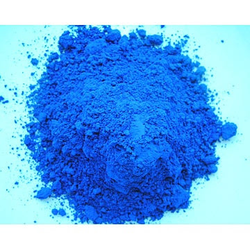
Cobalt is another beautiful and sea drenched blue. This color is much deeper and richer and brings to mind old architectural blueprints or vintage glass bottles. I once painted a bedroom this color and loved it. This color is so strong and beautiful when mixed with white (and look at that blueprint!)
NAVY
This color is so sophisticated and structured and handsome. Right out of the academy this color says it's in charge. Navy is the disciplined brother of black. Not nearly as rebellious, but serious and sexy. Rooms in this color are classic, and preppy, like a wool blazer or a peacoat, which is probably why it looks so good with a bit of gold accent (the buttons) and white (the oxford underneath.) Try mixing in some woods and rich leathers for a little more sophisticated elegance.
CAROLINA BLUE
It's in my blood, (it is my alma mater, and I did cheer for Carolina my freshmen year.) It's the color of the sky, it's the color that we see when the molecules in the air scatter more blue light from the sun than red light. Instead of asking the age old question of "why is the sky blue?" we should ask ourselves, "why wouldn't the sky be blue?" It's beautiful, it's ethereal, it's dreamy, it's a warm sunny afternoon. Another southern porch ceiling favorite, this color whispers as softly as a cloud. It's quiet and understated, but yet so comforting.
After looking at all these wonderful shades of blue, I'm feeling calm and relaxed and ready to let Monday roll in. Hope you have a happy Monday too!
Subscribe to:
Comments
(
Atom
)


