
Thursday, September 26, 2013
Monday, September 23, 2013
Woodward Nursery
For Residential II this past week, we were given the fun task of finishing a nursery for a sweet family, (Mark and Holly Woodward) who are adopting a 6 month old within the next month. The room already had good bones, and the couple has great style, so we knew this nursery was going to be fantastic! The Woodwards do not know if they will be adopting a little girl or boy, so we wanted to keep the nursery neutral but still give it personality.
Here's what we decided to do.

We gave the room a bold dose of modern bright yellow with the fun striped rug from Dwell Studio in Citrine and Cream. We chose the crib from ducduc and several pieces of the furniture came from Room and Board. The cute bird bedding and coordinating sheet, crib skirt and window treatments, as well as some of the fantastic storage options, came from The Land of Nod
The wall color is called Parma Gray by Farrow and Ball. It's got just a touch of blue in it, but still provides a soft and neutral enough background. We also chose to feature one wall in David Hicks Hexagon wallpaper in gray.
The mid-century modern pendant light and Eames Rocker were from Design Within Reach, and will fit in this space for years to come.
Pops of turquoise create interest and make the color palette just a little more playful and fun. We were able to find some great pieces of art for the nursery on etsy as well as a few cute and quirkly accessories from Jonathan Adler.
While rendering this room, I couldn't help but think about the 1980's French's Mustard Commercial "You are My Sunshine." So, for your enjoyment, I'll share!
Thursday, September 19, 2013
bird brains
Yesterday, I played around with Olioboard and entered their Fly Away Birdy Challenge. I'm still trying to get the hang of it, but here's what I came up with.

 You can vote for either one of them by going to www.olioboard.com signing in or signing up, and vote! Easy, peasy, lemon squeezy! There are lots of cool entries to peruse, and some people almost treat the boards like scrapbooking while others treat them more like typical interior design boards. I can see the laundry piling up while I play around on this site. The neat thing is it's free, or you can choose to upgrade for about $9.00 a month. It's also a really cool way to price out a room, and it's superdy duperdy easy.

I also entered the Pretty in Pink Design Challenge with this entry.

Wednesday, September 18, 2013
In my Residential Interiors II class, we learned about personality types. I am an ESFJ. That's extroverted, sensing, feeling judging. I feel like this is a pretty fair assessment, although I do border between extroverted and introverted.
We were then given the assignment to design an office for a female attorney in her late 50's who had just been appointed as a D.A. Her personality type was ESTJ. After learning more about ESTJ's and some fairly well known, powerful women who share the same personality type, I set out to design her office space. I also wrote a profile about her that I will share.
We were then given the assignment to design an office for a female attorney in her late 50's who had just been appointed as a D.A. Her personality type was ESTJ. After learning more about ESTJ's and some fairly well known, powerful women who share the same personality type, I set out to design her office space. I also wrote a profile about her that I will share.
In designing a space for this client who is in her late
fifties and recently appointed as a District Attorney, I learned that she is an
ESTJ on the Myers-Briggs personality Indicator. ESTJ or Extroverted, Sensing, Thinking Judging people are
known as rational or logic based people.
ESTJ’s value tradition and laws and expect others to as well. They are strong, assertive people who
are natural born leaders. They are
quite confident and bold.
Some notable ESTJ women include Michelle Obama, Hillary Clinton,
Condoleeza Rice, Martha Stewart, Michelle Malkin and Ann Coulter. All of these women exude strength,
leadership, hard work and determination.
In designing a space for this client, I knew that she is
used to working in what is considered to be a man’s world, and as such, she is
most likely used to a more masculine aesthetic. I wanted to take that typical lawyer’s office and add just a
few bits of softness or femininity to it without overpowering the space. I chose to do this with a bold geometric
print rug that reads gender-neutral and then a few gold and glitzy pieces
including the gold Barbara Barry credenza. Soft supple caramel color leather warms up the space while
the chairs sitting opposite the desk have a feminine caning and soft lush mohair,
the color of both the chair and cushions maintain a gender neutrality. The lighting is soft and gold but
oversized and play up the design principles of balance and scale which are
coincidentally a primary theme of the law ethos.
We chose a few pieces of art work, including a mobile
art/book shelf that operates on the theme of balance and a build-able wood
sculpture game that serves as functional art. We also included the client’s law diploma and an emblem of
her undergrad alma mater, UNC Chapel Hill.
My concept for this space was a woman who could have a quaich
of brandy or scotch with her co-workers in her black or navy power suit, but
she’s probably sporting a pair of Louboutin’s and just a touch of gold!


When designing spaces for clients, it is definitely worth considering their personality type. If you're interested in finding out your own personality type, you can take the quick quiz right here.
Wednesday, September 11, 2013
Color, Color, Color
It's about time for another color post, and this one has got me giddy. As you may well know, I love color. I love saturated color, I love bold bright colors, neons, and I do dig pretty hard on some pastels too. One thing that I love most about color is when it POPS against a white background. As I am working on gathering inspiration for my Kids Camp Competition, I came across a few pictures that just spoke to me. After further investigation, I found that these pictures were all the brilliant work (I mean that in every sense of the word) architect, Emanuelle Moureaux. Not only is this lady an architect, she's practically my age, and she's a frenchie (quelle surprise!) Well, she's an expat who has been living in Japan for quite some time.


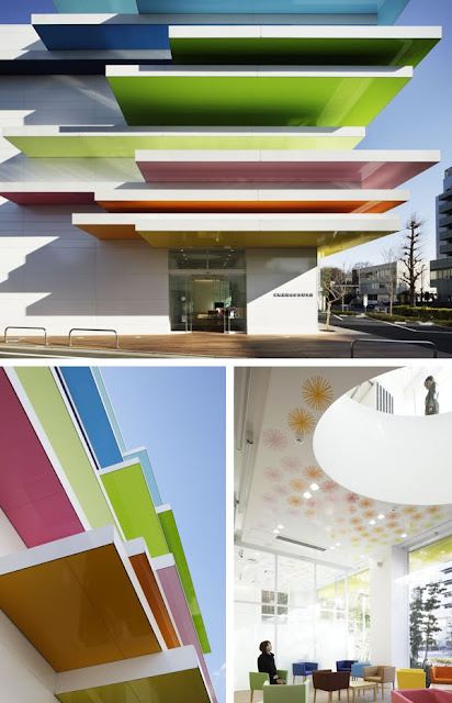


Emmanuelle has created the concept of "Shikiri", which literally means "dividing (creating) space with colors" in English.
Look at some of these beautiful spaces.


Emanuelle has won numerous awards in Japan for architecture, and she's developed some really cool products as well. Check out some of these.


Those above are cabinets with drawers. These bright colors really pack a wallop of personality into a space, and I can't imagine feeling sad or blue in a space like these. I'm really excited about moving forward with my camp and injecting fun and playfulness with color I'm also looking to work a little shikiri (not to be confused with Shakira!)
Subscribe to:
Comments
(
Atom
)